ABCZ: The logo creates recognition value and establishes identity. It illustrates in pictorial form what the company stands for. In the case of the Ziegelmaier agency, the initials of the company make it possible to visualize the core message with four letters: For architecture from A to Z, from a single source and from a single mould.
The Website
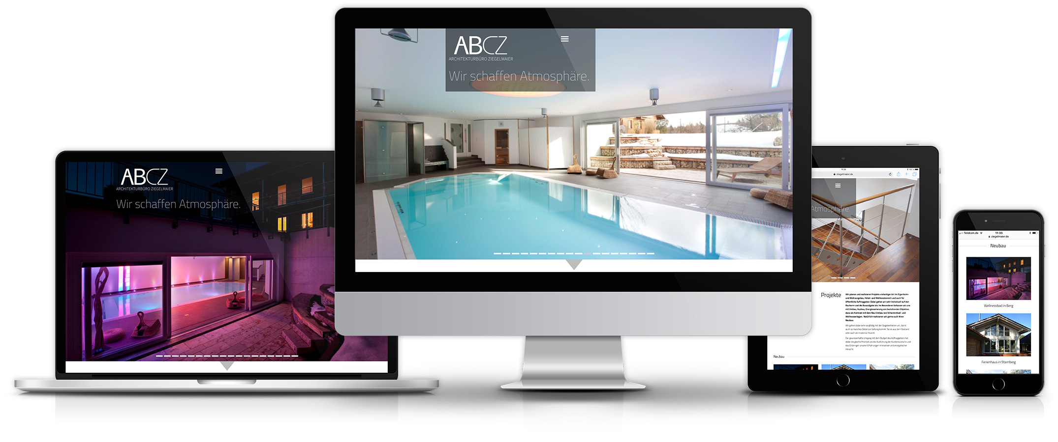
In the next step, we designed the new website for the architecture firm. Architect Claudia Ziegelmaier does not pay attention to correct proportions of the walls alone, but has the entire ambience in mind from the very first sketch. The emphasis of a living space is on living, not on space. Large-format representations of the images provide a better insight into details and convey atmosphere. An intelligent filter system makes it possible to organize the very extensive website in terms of content and, as a visitor, to find specifically the kind of projects one is interested in without much detour.